18 years ago
Friday, December 29, 2006
MOTW #58
In honor of New Year's Eve I had posted an interactive Guy Lombardo map of London, Ontario showing all the sites related to his life growing up there. There were lots of amusing and somewhat violent stories attached to the various places he lived and played music. Sadly, the map seems to have disappeared from cyberspace.
Thursday, December 21, 2006
Thursday, December 14, 2006
MOTW #56
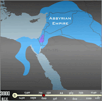
This is an animation showing the history of empires in the Middle East with a corresponding time line.

Thursday, December 7, 2006
MOTW #55
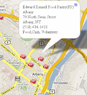
The Giving Map is a simple web-based application that identifies locations in New York's Capital District (aka Albany-Schenectady-Troy) where individuals can make donations of food, cash, clothing or their time this holiday season. While this is not a comprehensive list of all the giving opportunities available, it does provide the names, locations and contact information for many major charitable organizations in the Capital District.

Thursday, November 30, 2006
MOTW #54
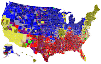
Pop vs. Soda - what do you think? The image below links to several interactive maps and a whole research study about who calls soft drinks which generic names in various regions of the country. Like the famous "mayonnaise line" there are distinctive lines between pop, soda and coke regions. Also note the odd outlying regions around St Louis and Milwaukee.

Thursday, November 16, 2006
MOTW #53
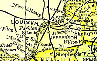
The Livingston County (Michigan) Historical and Genealogical Project has posted the entire USA section of Rand McNally's "New 11 x 14 Atlas of the World" from 1895. Click on the map and scroll down a ways (below the Pledge of Allegiance) to get to the list of states. Click the "button" underneath any state to get a state map or a map for any county in that state.
Thursday, November 9, 2006
Thursday, November 2, 2006
Thursday, October 26, 2006
MOTW #49
Click on your favorite city and see today's front page courtesy of the Newseum.
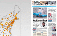
Note that you can do this worldwide
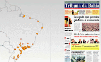

Note that you can do this worldwide

Thursday, October 19, 2006
MOTW #48
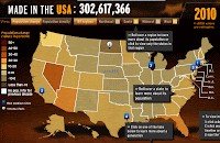
There's been lots of ballyhoo about the US Population
having reached 300 million this past week. Here is a pretty cool
interactive map from MSNBC's web site. There's a timeline on the
bottom so you can see population change through history and lots of info
when you scroll around the states. I had trouble with this in Internet
Exploder but it worked great in the Netscape/Firefox world. Happy
mapping!

Thursday, October 12, 2006
Friday, October 6, 2006
MOTW #46
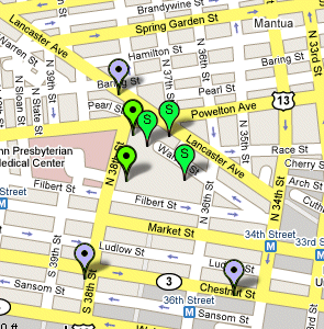
This map was done as part of a study of food choices around University City High School in Philadelphia. The map lets you choose categories of food and recreational opportunities in an attempt to advocate for better opportunities to make healthy choices in an inner city neighborhood.

Thursday, September 21, 2006
MOTW #45
Even right wing web sites occasionally contain worthwhile information. Here is a map of botched police raids from the Cato Institute.
Thursday, September 14, 2006
Thursday, September 7, 2006
MOTW #43
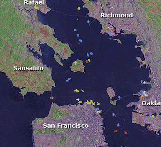
This one's almost as cool as the LA Airport Monitor. Watch boats travel around the San Francisco Bay, get information about each boat, its destination and ETA. Give the boats a minute or two to load and then let them do their stuff!

Thursday, August 31, 2006
MOTW #42
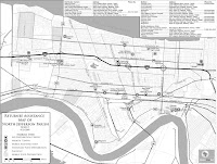
In honor of the first Anniversary of Hurricane Katrina here is a map of services available to returnees to Jefferson Parish. Thanks to Global Map Aid for the map and for their good work.

Thursday, August 24, 2006
MOTW #41
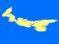
Want to know where to go for a lobster dinner in Prince Edward Island? Here you go. The PEI online Visitor's Guide lets you build a travel itinerary and make a map of it on the fly.

Thursday, August 17, 2006
Thursday, August 10, 2006
MOTW #39
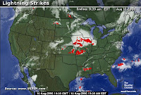
The Weather Channel's web page has frequently updated maps of lightning strikes. They often show some pretty interesting patterns.

Thursday, August 3, 2006
MOTW #38
This entry was for a map of the President's sinking popularity. That map seems to have disappeared along with the President's popularity.
Thursday, July 27, 2006
Thursday, July 20, 2006
Thursday, July 13, 2006
MOTW #35
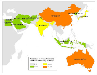
This is one of those maps that I posted a while back and didn't document properly. It shows countries in the Middle East, Asia and Oceania with the percentage of American youth who are able to locate them on a map. I made the map with data that I don't recall the origins of.

Thursday, July 6, 2006
MOTW #34
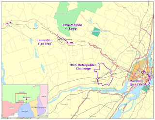
This is a map outlining the places I rode my bike during my May-June bicycling vacation in Quebec. I went up there for the Montreal Bike Festival and did a bunch of other rides in the Laurentians.

Friday, June 16, 2006
MOTW #33
Thursday, May 25, 2006
MOTW #31
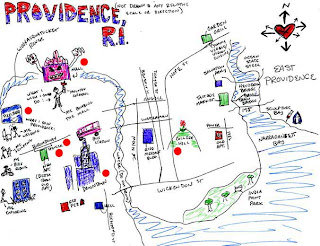
Another set of maps from the Lori Napoleon collection Her description:
"Providence, Rhode Island.
This amazingly illustrated map was one of the many maps that were submitted to me at the Psy-Geo Provflux, held at the steelyard seen on the left. Art exhibits/installations were spread throughout the entire lot; an adobe hut, a greenhouse, many rooms and nooks inside the warehouse. The space that i was given to do my maps installation was a wonderful, musty room with exposed brick walls and a long industrial sink in the center. I affixed my collection according to different categories all around this room, and spent the entire night - (complete with numerous coffee/processed food breaks) and on to the morning, completing the installation. I became really immersed in that room and felt very at home with the freedom to create and arrange, all while the other PIPsters worked aduously on the cleaning, arranging, and painting of the exhibition spaces. the amount of work and care put into the show was incredible, and i am lucky to have been able to be a part of it, to go to Providence where this map originated from. Highlights on the map include the steel mill, some neighborhood architecture, and a very interesting public interference on college hill. "
 Here's another from the same exhibit showing the way to the "Mafia Gym"
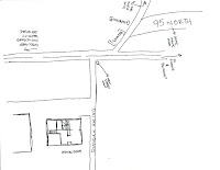
"Providence, Rhode Island.
This amazingly illustrated map was one of the many maps that were submitted to me at the Psy-Geo Provflux, held at the steelyard seen on the left. Art exhibits/installations were spread throughout the entire lot; an adobe hut, a greenhouse, many rooms and nooks inside the warehouse. The space that i was given to do my maps installation was a wonderful, musty room with exposed brick walls and a long industrial sink in the center. I affixed my collection according to different categories all around this room, and spent the entire night - (complete with numerous coffee/processed food breaks) and on to the morning, completing the installation. I became really immersed in that room and felt very at home with the freedom to create and arrange, all while the other PIPsters worked aduously on the cleaning, arranging, and painting of the exhibition spaces. the amount of work and care put into the show was incredible, and i am lucky to have been able to be a part of it, to go to Providence where this map originated from. Highlights on the map include the steel mill, some neighborhood architecture, and a very interesting public interference on college hill. "
 Here's another from the same exhibit showing the way to the "Mafia Gym"
Thursday, May 18, 2006
MOTW #30
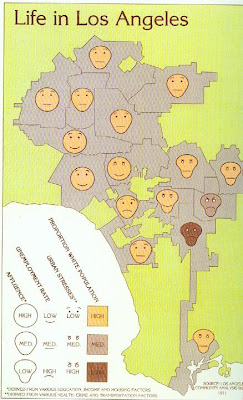
This is a ridiculously clever map showing an index of happiness in LA using 4 separate variables, each showing a facial trait representing differing levels of stress or racial makeup. These are Chernoff Faces, a visualization technique created by mathematician Herman Chernoff. The map was created in 1971 by Cal State geography professor Eugene Turner for the Los Angeles Community Analysis Bureau.

Thursday, May 11, 2006
MOTW #29
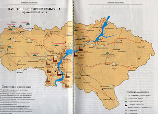
This is a map showing German settlements around Saratov (CAPATOB in cyrillic) along the Volga River in Russia.
Nine churches are identified on this double-page map titled "Monument Map" which was taken from "Treasures of the Russian land; Quarterly Journal of the All-Russian Society for the Preservation of Cultural and Historical Treasures", Artist: G I Metchenko Nr 40- (3-4/1998) [in Russian language only, out of print].
Legend: Green tents represent palaces, grand manors, estate parklands. Pale churches with round roofs represent Russian village churches. Brown churches with steeples represent German (Lutheran, Catholic, Reformed) churches. Other symbols shown include: Six-pointed stars representing archaeological sites (these are not Jewish sites). The six-pointed star is labeled as "stoyanka" - meaning "stopping place" for the "first inhabitants", the three pebble stones represent burial mounds, open boxes representing burial sites (tombs), squares representing ancient town sites, wheels representing ancient settlement sites. Map contributed by Vera Beljakova-Miller.
from http://www.volgagermans.net
Nine churches are identified on this double-page map titled "Monument Map" which was taken from "Treasures of the Russian land; Quarterly Journal of the All-Russian Society for the Preservation of Cultural and Historical Treasures", Artist: G I Metchenko Nr 40- (3-4/1998) [in Russian language only, out of print].
Legend: Green tents represent palaces, grand manors, estate parklands. Pale churches with round roofs represent Russian village churches. Brown churches with steeples represent German (Lutheran, Catholic, Reformed) churches. Other symbols shown include: Six-pointed stars representing archaeological sites (these are not Jewish sites). The six-pointed star is labeled as "stoyanka" - meaning "stopping place" for the "first inhabitants", the three pebble stones represent burial mounds, open boxes representing burial sites (tombs), squares representing ancient town sites, wheels representing ancient settlement sites. Map contributed by Vera Beljakova-Miller.

from http://www.volgagermans.net
Thursday, May 4, 2006
MOTW #28
Another cool java application. Watch planes take off and land at LAX. I can sit and watch this for hours!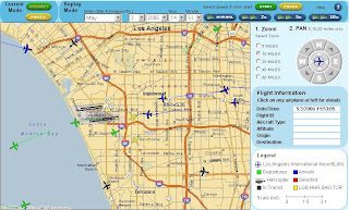
UPDATE: It appears that LAX no longer participates with Passur and some of the other airports don't seem to be loading anything. The image above now links to Newark International instead where there is still some action to watch. If nothing's happening in Newark you can try some of their other airports.

UPDATE: It appears that LAX no longer participates with Passur and some of the other airports don't seem to be loading anything. The image above now links to Newark International instead where there is still some action to watch. If nothing's happening in Newark you can try some of their other airports.
Friday, April 28, 2006
MOTW #27
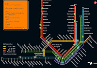
This is really cool and useful too. A map showing where all the trains in Copenhagen are and tracking their movements. Warning - if you don't have java it won't work correctly and if you do you may have to wait a bit for the trains to appear.

Thursday, April 20, 2006
Friday, April 14, 2006
MOTW #25
I created this map by overlaying a map of fault lines in the San Francisco Bay area with a satellite image of the area. 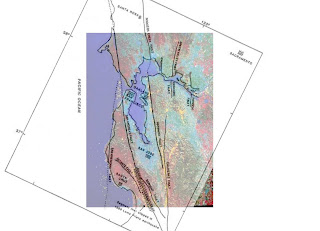

Thursday, April 6, 2006
MOTW #24
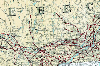
In honor of the 100th anniversary of the Atlas of Canada here's a 100-year old map showing the telegraph network in Ontario and Quebec.

Thursday, March 30, 2006
Friday, March 24, 2006
Thursday, March 16, 2006
MOTW #21
A quilt map of the wonderful state of Oregon by one of Portland's finest bloggers, songwriters and quilters, Michael5000
see below for the author's description
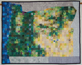 "Each square of this Quilt Map of Oregon represents 12 miles square. The map is loosely based on land use maps from the Atlas of Oregon (q.v.). Quilting represents county boundaries. Most major cities, mountains, and lakes are shown, and are accurately placed within four or five miles. Those familiar with the state should be able to pick out the Ochoco, Strawberry, Blue, and Wallowa Mountains, as well as familiar features like the Willamette Valley, Mt. Hood, Crater Lake (and Wizard Island!), and the lower Columbia River. " -Michael5000
see below for the author's description
 "Each square of this Quilt Map of Oregon represents 12 miles square. The map is loosely based on land use maps from the Atlas of Oregon (q.v.). Quilting represents county boundaries. Most major cities, mountains, and lakes are shown, and are accurately placed within four or five miles. Those familiar with the state should be able to pick out the Ochoco, Strawberry, Blue, and Wallowa Mountains, as well as familiar features like the Willamette Valley, Mt. Hood, Crater Lake (and Wizard Island!), and the lower Columbia River. " -Michael5000
Thursday, March 9, 2006
MOTW #20
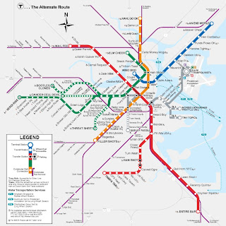
Anagram transit maps are suddenly all the rage. You may find your favorite city at Boing Boing
where you can spend hours of fun.
Here's one for Boston:
where you can spend hours of fun.
Here's one for Boston:

Friday, March 3, 2006
MOTW #19
The original posting was a demo of Microsoft's Live Local. That is now fully up and running.
Thursday, February 23, 2006
MOTW #18
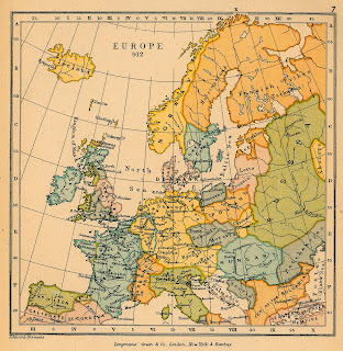
Some history for you. A map of Europe in 912. I probably stole it from the Perry-Castañeda Library Map Collection at the University of Texas.

Thursday, February 16, 2006
Thursday, February 9, 2006
Thursday, February 2, 2006
Thursday, January 26, 2006
Thursday, January 19, 2006
Thursday, January 12, 2006
MOTW #12
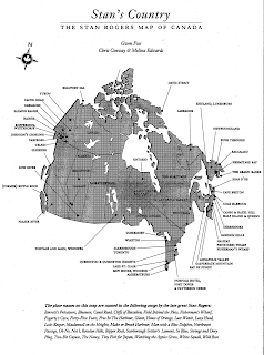
This map was originally published in the Canadian magazine Geist. They have a "Caught Mapping" feature showing maps of places in Canada grouped around a common theme. This is a map showing locations mentioned in songs by Canadian folk singer Stan Rogers. Back in my college days I spent many Saturdays evenings listening to Stan and others on the Hudson River Sampler from WAMC in Albany.

Thursday, January 5, 2006
MOTW #11
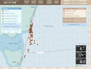
One of Australia's premier summer events is the Sydney Hobart Yacht Race. This race takes place in late December. During the race you can follow the progress of the boats using the Yacht Tracker. This is an interactive map that lets you access a ton of information about each boat by clicking on it, including position, time, crew and photos.
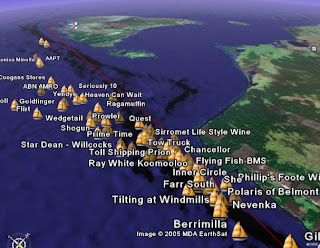 You can also follow the progress of the boats on google earth

 You can also follow the progress of the boats on google earth
Subscribe to:
Comments (Atom)


