
A product of five years of work, this 1967 atlas is a remarkable work of experimental art as well as cartography. Here is an example from a population distribution map that looks like a bunch of magic 8-balls.

The atlas was created under the direction of Jacqueline Beaujeu-Garnier and Jean Bastié in combination with numerous governmental agencies and universities. It begins with some size and population comparisons,

followed by a section on physical geography.


There are many pie chart maps of socioeconomic factors. Here are foreign residents. The most common nationalities here are Spaniards (magenta), Italians (purple) and Algerians (blue). Gray is for other nations.

There is much transportation goodness. Here is one showing increases in rail travel.

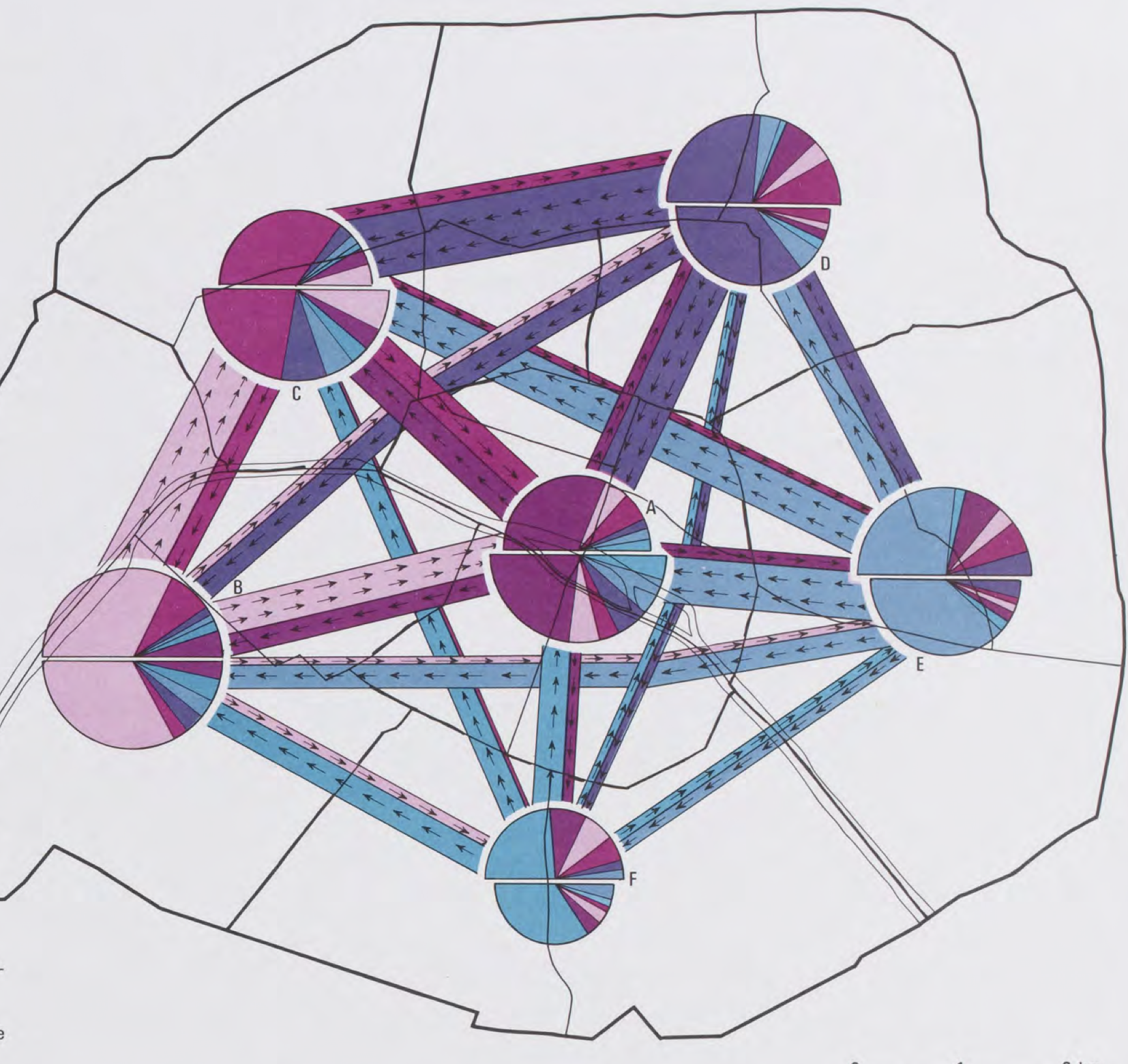
This complicated map shows commuting patterns between arrondissements.


No comments:
Post a Comment