Wednesday, July 31, 2019

Vietnam, Past Is Prologue

The Smithsonian American Art Museum's  exhibit Vietnam, Past Is Prologue features some beautiful, creative maps from artist Tiffany Chung.
https://s3.amazonaws.com/assets.saam.media/files/styles/max_1300x1300/s3/images/2019-02/Operation%20Lam%20Son%20719%2C%2030%20Jan%20%E2%80%93%206%20April%201971.jpg?itok=yNLTXAO9
Operation Lam Son 719, 30 Jan – 6 April 1971

The exhibit highlights the experiences of former refugees from Vietnam where Chung grew up and experienced the war. Her work re-maps memories that were denied in official records. The round bead-like shapes may be troops or civilians or both.
https://s3.amazonaws.com/assets.saam.media/files/styles/max_1300x1300/s3/images/2019-02/Easter%20Offensive%201972%20%E2%80%93%20NVA%20attacks%20of%20MR%20IV.jpg?itok=pbMrs2_x
Easter Offensive 1972 – NVA attacks of MR IV
All maps are done with acrylic, ink and oil paints. Here are boat trajectories from the exodus out of Vietnam.
https://s3.amazonaws.com/assets.saam.media/files/styles/max_1300x1300/s3/images/2019-02/Reconstructing%20an%20exodus%20history%20boat%20trajectories%20in%20asia.jpg?itok=c1IagqjD
Reconstructing an exodus history boat trajectories in Asia, 2017

https://s3.amazonaws.com/assets.saam.media/files/styles/max_1300x1300/s3/images/2019-02/Operation%20Lam%20Son%20719%2C%20Feb%201971%20%E2%80%93%20Operation%20Dewey%20Canyon%20II%20%26%20the%20attack%20toward%20Khe%20Sahn.jpg?itok=9kCr2J2y
Operation Lam Son 719, Feb 1971 – Operation Dewey Canyon II & the attack toward Khe Sahn
https://s3.amazonaws.com/assets.saam.media/files/styles/max_1300x1300/s3/images/2019-02/Operation%20Lam%20Son%20719%2C%20Feb%201971%20%E2%80%93%20ARVN.jpg?itok=bS8zLFJ2
Operation Lam Son 719, Feb 1971 – ARVN

For more on the artist and many more maps see her page at Tyler Rollins Fine Art. The exhibition runs through September 2, 2019.

Wednesday, July 24, 2019

Moon Landings

National Geographic produced a beautiful visualization of the moon landings. Here is a detail showing the Apollo 11 landing 50 years ago along with other landings.
https://www.nationalgeographic.com/magazine/2019/07/new-phase-of-exploration/?sf214270680=1
Blue dots are American landings and red Russian. Like many of their graphics the whole thing is dense with information.
https://twitter.com/natgeomaps/status/1153447184827920389?s=21
I like the timeline in the corner showing the early missions (US missions are blue, Russian red, X marks failed missions-they get fewer as time goes on).
Here are the more recent and planned missions including many more colors for many more nations, including India, The European Space Agency, Israel, China, Japan and South Korea.
The pink and purple colors in the corners show lunar topography on both sides of the moon. The entire graphic and more can be seen here on nationalgeographic.com


Wednesday, July 17, 2019

Grab Bag

Here's a bunch of random maps. They won't "change the way you see the world" like so many other clickbait-y sites claim. They're just kind of interesting, or pretty, or something. Click on the map for the original source and higher resolution.

Meat Production on Ranches - via Pearson Education though I lost the link.
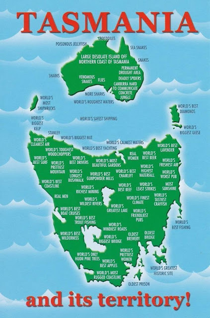
Tasmania's cartographic revenge - via Reddit
https://www.reddit.com/comments/auec0h

WestJet Destinations, 2000 featuring a Canada without Montreal or Toronto.
https://www.flickr.com/photos/erussell1984/45543438864

Proposed development of Toronto's industrial waterfront, 1910
https://static.torontopubliclibrary.ca/da/images/LC/maps-r-80.jpg
- via Toronto Public Library

Saloons, free theatre and "houses of ill fame" in Buffalo, 1893. If you're looking for this neighborhood, it's basically been torn down and replaced with expressways. Easy access from the Children's museum though.
https://imgur.com/a/7ZJ47DO

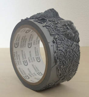
Geo-Eye (Mount Inasa), 2015 by Takahiro Iwasaki carved on a roll of vinyl electrical tape. Iwasaki is a Hiroshima-based artist. Mount Inasa is in Nagasaki.
https://www.artsy.net/artwork/takahiro-iwasaki-geo-eye-mt-dot-inasa
Where Europe and Asia would fit in North America climate-wise - via askthebirds
http://askthebirds.org/wp-content/uploads/2018/09/canada-physical-map-best-of-beautiful-nts-maps-canada-of-canada-physical-map.jpg
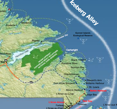
Tourism map - where to see whales, seabirds and icebergs in Newfoundland And Labrador - issuu.
https://issuu.com/newfoundlandlabradortourism/docs/whales_birds_bergs_map
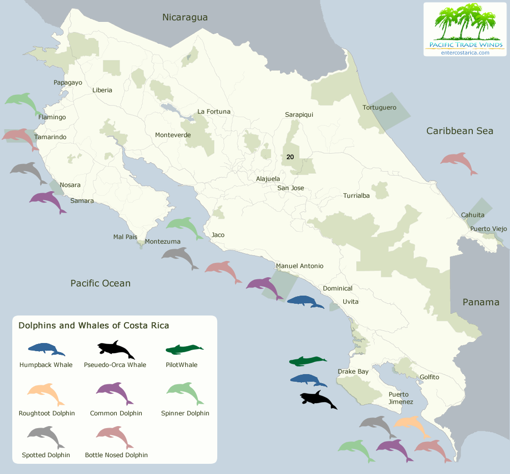
Whales and dolphins in Costa Rica - via Enter Costa Rica
https://www.entercostarica.com/images/maps/map-whales-dolphins-flat-1000.png


Wednesday, July 10, 2019

NBA Attendance

I made this map as part of a software tutorial (this explains why it still needs work), but mainly as an appropriate map subject for the Kawhi North Arrow. I'm not a big basketball follower but when I saw the picture of Kawhi Leonard with his "North" jersey and arms raised I thought it made the perfect north arrow. I put it out on Twitter and way more people liked it than the usual junk I tweet out.

The source of the data is here on ESPN. I was almost as excited as Kawhi to see my 76ers at the top of the list - we finally won something!


Tuesday, July 2, 2019

Bee Pollination

I'm a few days late for National Pollinator Week but here it is...

The map no longer appears to be on National Geographic's web site but here is a more readable image (if you click it for the larger version) from this blog post of the Hampden County Beekeepers Association

An article in Smithsonian highlights areas where agriculture is at risk due to a high need for pollination coupled with low wild bee populations. The red counties below are the most high risk areas.
https://thumbs-prod.si-cdn.com/YXYU1fXaQonKtPEk3ai2zG6yTtQ=/fit-in/1072x0/https://public-media.si-cdn.com/filer/4f/a4/4fa4c242-84b0-478d-b9f2-97b9b8f8b93c/133583_web.jpg
These areas including California's Central Valley, The lower Mississippi Valley and upper midwest are all yellow (low abundance areas) in the map below.
https://thumbs-prod.si-cdn.com/puBJO7EzmPHg0rpp6vaBxZEg7DQ=/fit-in/1072x0/https://public-media.si-cdn.com/filer/64/4c/644c47d9-cfb5-471a-abe2-eb869b65f484/133584_web.jpg


Wednesday, June 26, 2019

Treaty of Versailles

This Friday, June 28th marks the 100th anniversary of the Treaty of Versailles. This treaty changed the borders of Europe, at a particular disadvantage to Germany. Here is a 1920 newspaper map "from book" via UCSB professor Harold Marcuse's web pages.
http://marcuse.faculty.history.ucsb.edu/classes/33d/projects/1920s/CarlosVersaillesMap650pxw.png
Another map, via Mark Callagher shows the German territorial losses much more clearly.
http://markcallagher.com/history/ww2readings/2_Treaty%20of%20Versailles/page_09.htm
In addition to the widely mentioned losses to Poland, France and Denmark there are more obscure enclaves that I was not aware of. These include Eupen-Malmedy, a German speaking region of eastern Belgium.
https://en.wikipedia.org/wiki/Eupen-Malmedy#/media/File:Eupen-MalmedyGrenzveränderungen.jpg
Map via Wikipedia
Within this region was the jointly administered area of Neutral Moresnet. This was a neutral sliver of land between Belgium (originally the Netherlands) and Prussia that both countries were interested in because of a valuable zinc mine. Treaties after Napoleon's empire left the area neutral pending a future agreement. The region, along with the rest of Eupen-Malmedy was awarded to Belgium after the Treaty of Versailles. The region is shown in white on the postcard below.
Postcard via Wikipedia

There was also the brief existence of the Free State of Bottleneck. This bottleneck shaped area was leftover when the French and American post World War I circular zones of control did not meet
By Ziegelbrenner -.Source: Ravenstein Radwanderkarte, 1923
This region was cut off from the rest of Germany and was declared as a microstate in January, 1919. It was abolished in 1923. The state had about 17,000 people and printed its own emergency money featuring a map of the area.
https://upload.wikimedia.org/wikipedia/commons/b/ba/Notgeldschein_Freistaat_Flaschenhals_01.JPG
Image via Wikipedia


Wednesday, June 19, 2019

Mercury

Data illustrator Eleanor Lutz has created a really nice topographic map of Mercury.
The map is laid out with a large view of the planet's eastern hemisphere. In the corners surrounded by leafy details are the northern, southern and western hemispheres as well as a cutaway view of the planet's core.
Here is some detail - the planet's features are from the International Astronomical Union. Mercury's craters named for writers and artists.
Her map poster can be purchased here, along with other items like pillows and clocks decorated with the map's artwork.

Lutz also gives you a link to her code and tutorial showing you how it was done. Also see her maps for MarsVenus, and the Moon- as seen here
https://www.redbubble.com/people/eleanorlutz/works/39425758?p=poster&rel=carousel