
Here is the second half of the #MapFailbruaryChallenge. For the first half and explanations see here. Here are the categories, again with minimal commentary.
Day 15 - You do not need to know geography to be a cartographer


Day 18 - Make a country look like its flag classification map - a popular and very hard to read genre on the internet.

Day 19 - that really should have been like 3 different maps

Day 20 - Irrelevant variables

Day 22 - could have been a bar chart. I tried to make an actual bar chart out of goofily deformed Italys. The categories (ie. breads, cereals and pastas) were reduced into simplistic cliches for fun.


Day 24 - shocking correlations. Turns out your toilet had jets that flush in a designed direction independently of where you are but your sink...

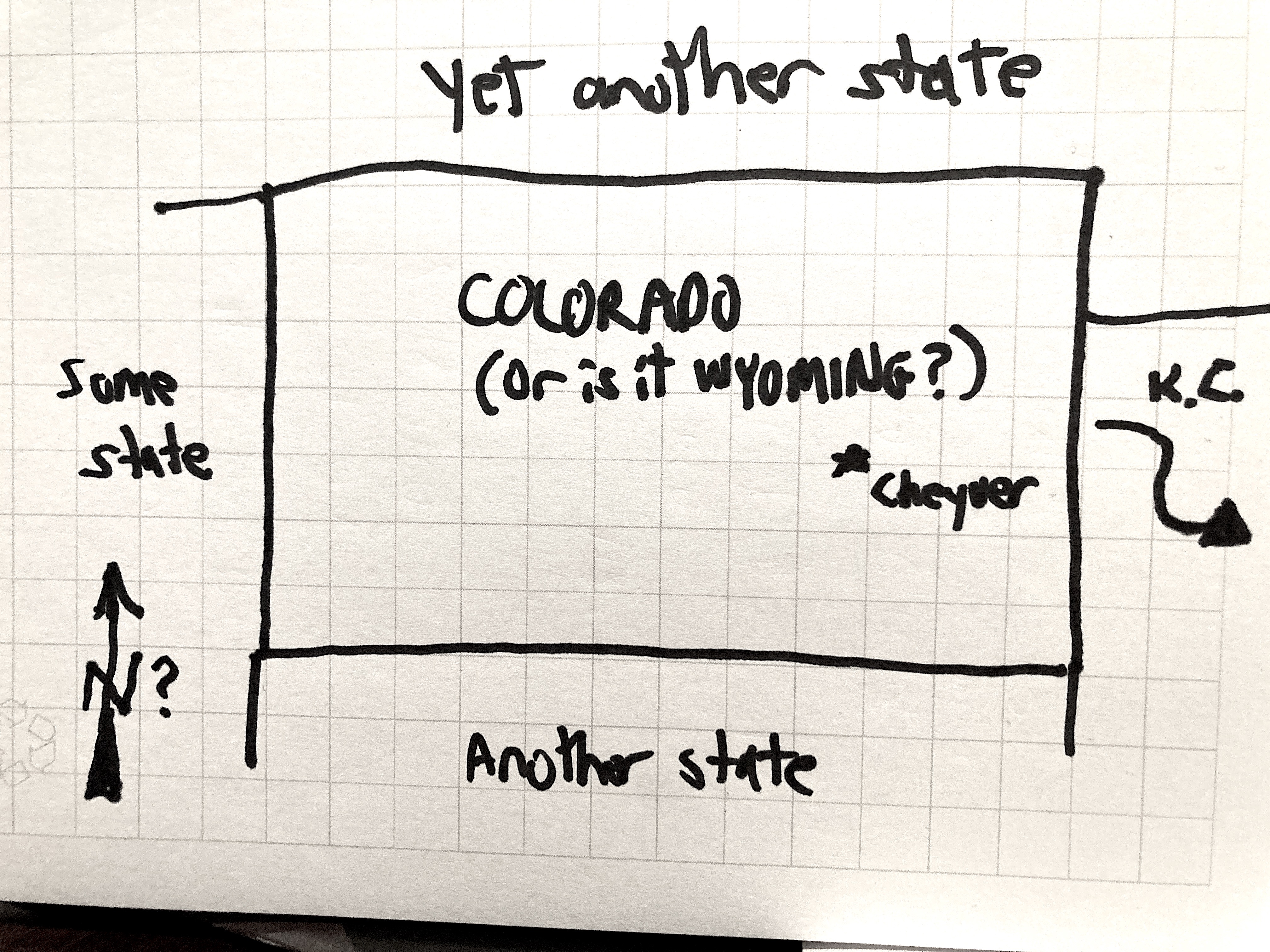
Day 25 - The map with the highest number of hardly detectable errors

Day 26 - worst hiking map


Day 28 - worst abuse of digital elevation model (DEM). I had a DEM of the Puget Sound area that I flattened a bit, messed with the colors and made it look like an oil slick.


No comments:
Post a Comment