Wednesday, May 25, 2022

Paris Regional Atlas, 1967

A product of five years of work, this 1967 atlas is a remarkable work of experimental art as well as cartography.  Here is an example from a population distribution map that looks like a bunch of magic 8-balls.

The atlas was created under the direction  of Jacqueline Beaujeu-Garnier and Jean BastiĆ© in combination with numerous governmental agencies and universities. It begins with some size and population comparisons,

followed by a section on physical geography.

This highly detailed map shows types of habitations colored by age with additional indications about which residences contain gardens or workshops.

There are many pie chart maps of socioeconomic factors. Here are foreign residents. The most common nationalities here are Spaniards (magenta), Italians (purple) and Algerians (blue). Gray is for other nations.

There is much transportation goodness. Here is one showing increases in rail travel. 

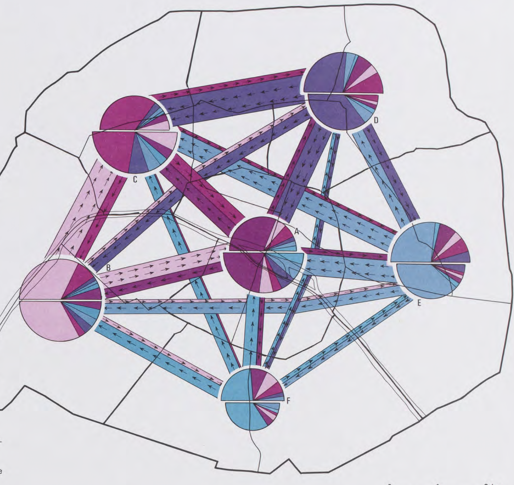
This complicated map shows commuting patterns between arrondissements.

Finally, this one groups settlements by urban vs. rural, linear vs. round, tight vs. looser settlements, farms vs. specialty agriculture, degree of isolation and settlement age - all in one map.
You can read more about the atlas here (in French) or enjoy the entire atlas in .pdf format here.

Thursday, May 19, 2022

Putting Together The Pieces of Ohio

Ohio's boundaries seem so "regular". Three straight lines, a river and a lake. That regular form though is composed of many irregular pieces, each with their own history. I came across this map and Wikipedia entry, while looking for something completely unrelated and was intrigued enough to dig a little deeper.


Many of these "purchases" and "agreements" involved forced displacement of Native Americans, wars, massacres, bad faith treaties and swindles. Here are a few examples.

The Connecticut Western Reserve were lands claimed by Connecticut. That colony's charter included a "sea to sea" provision, giving it all lands within the state's latitude all the way to the Pacific Ocean. The claims in Pennsylvania and west of Ohio were ceded after the Revolutionary War but the "Western Reserve" of Ohio was held onto for another 14 years. This area included the "Firelands" at the western edge. These were lands given as restitution for residents of numerous Connecticut towns that were burned by the British during the war. The terms "Firelands" and "Western Reserve" are both still commonly used today.

Just south of this, the small uncolored area represents the Moravian Indian Grants, lands that were granted to Christian Indians who had been converted by Moravian missionaries. These grants were made as reparations after 96 of them were murdered in the 1782 Gnandenhuteen Massacre under the false notion that they had participated in killings of settlers. As these natives were driven further west, the land was bought back and sold to white settlers. These lands were not surveyed in the usual rectangular pattern leading to some interesting shapes.

To the west and south much of the lands were sold as rectangular tracts in the township and range pattern. The small green square in the northwest is the Twelve Mile Square Reservation surrounding Fort Miami, a fort built by French settlers on the Maumee River. It was rebuilt by the British to help the natives fight U.S. settlers in the Northwest Indian War. This war, begun in 1786 eventually resulted in the displacement of most indigenous people from Ohio.

Like Connecticut, Virginia also claimed lands far to the west of the state including areas of Ohio. Before there was a state of West Virginia, Virginia shared a boundary with Ohio. The large green area in the southwest were lands that Virginia granted to veterans in lieu of cash for their service in the Revolutionary War. The boundaries of this district were contentious and a line separating Native American lands from lands open for white settlers was ambiguously drawn in the Treaty of Greenville, leading to more unrest. Here are  the counties included in the Virginia Military District.

The small unmarked and unshaded area near the bottom tip of the map is the "French Grant", granted as compensation to French settlers after a series of worthless land deeds were sold to them by a company that did not own the land.
  

Finally, the northernmost pink area is the Toledo Strip. This area was claimed by both Ohio and Michigan and fought over in a "nearly bloodless" war. Both states deployed militias on opposite sides of the Maumee River near Toledo, but besides mutual taunting, there was little interaction between the two forces. The single military confrontation of the "war" ended with a report of shots being fired into the air, incurring no casualties. The war was resolved in 1836 with a compromise, allowing Michigan to claim three quarters of the Upper Peninsula in return for giving up its claim on the Toledo Strip.


Thursday, May 12, 2022

The Disapperance of Native American Land

Native American losses began at first contact with European settlers. "European colonization of the Americas, which began in 1492, resulted in a precipitous decline in Native American population because of new diseases, wars, ethnic cleansing, and enslavement." - via Wikipedia

Native Americans had mostly been driven out of the original thirteen colonies by the end of the American Revolution. The map below shows further land cessations between 1789 and 1816 in the "northwest" region.

via Getty Images
They were pushed even further westward into "strips of land stacked like cordwood" (quoted from Prairie Fires: The American Dreams of Laura Ingalls Wilder by Caroline Fraser p. 49). The designated Indian Territory (lands south of the Osages on the map below) was assigned to the "Five Civilized Tribes".

These tribes, the Cherokee, Chickasaw, Choctaw, Creek and Seminole were considered civilized because they had adopted Anglo-American practices such as Christianity, capitalism and in some cases the "civilized" practice of slavery. Despite being "civilized" they were still forced off their lands in the southeast and relocated westwards in the Trail of Tears.

The strip in southern Kansas was the Osage Diminished Reserve, an area left to them after signing many bad faith treaties. The rivers of their former land still bear the tribe's name.

Even after being removed from the rest of their land and granted this area of Kansas, it too became overrun with white squatters. These people included Charles Ingalls, father of Laura Ingalls Wilder. They settled on land they did not own and eventually drove the Osage out of Kansas entirely, forcing them to also relocate to Indian Territory. The tribe's base is now in northeastern Oklahoma.

Here is the full map above showing the lands assigned to "emigrant Indians" west of Arkansas and Missouri.

The Chickasaw after a long dispute paid the Choctaw for the westernmost part of their land. 

This map via Wikipedia illustrates the Trail of Tears beginning in the 1830's.

Some Cherokee had settled in northeastern Texas where they signed a treaty with Texas Republic President Sam Houston. In 1839 his successor backtracked on this treaty and sent militia to forcibly relocate them to Indian Territory. Here is a map of their final battle in Van Zandt County, via the Oklahoma Historical Society.

After the Civil War further incursions were made on Indian Territory with lands in the center of the future state ceded for potential white settlement. The western half of Indian Territory became Oklahoma Territory in 1890. Reservations in western Oklahoma were opened to white settlement leading to a series of land runs and drastically shrinking Indian Territory. Here is a map of Oklahoma and Indian Territories that year via Wikipedia. The thick red line divides the two.

Both territories sought statehood but in response to concerns from eastern politicians about creating two new western states they were combined into one state, Oklahoma, in 1907. Congress sought to dissolve the reservations as part of Oklahoma's statehood but the laws were vague and unevenly applied and has led to decades of uncertainty. In 2020 The Supreme Court of the United States, in the case of McGirt v. Oklahoma determined that much of the eastern part of the state remains Native American land. Though this case was primarily about jurisdiction of criminal cases, it has opened up questions about ownership, taxation, zoning and the enforcement of environmental policies.

A 1914 map submitted as part of the McGirt case shows the entire area that was post-1890 Indian Territory as Indian Reservations,

Image from Supreme Court Docket 18-9526 - Appendix p.33

making this by far the largest tract of Native American land in the country.

The future of this land will be determined through extensive negotiations between the tribes and state and federal authorities. For a deep dive into the Supreme Court's ruling see Indianz.com

Wednesday, May 4, 2022

My Family's Exodus from Ukraine

A few weeks ago some of my family members had a Passover seder. Passover is an exodus story. With huge numbers trying to leave Ukraine right now our thoughts turned to my own family's exodus from there. Rising antisemitism, employment restrictions and forced military service drove my family to risk everything to escape from Khotyn, Ukraine (then part of Austria-Hungary) and come to the United States. My great grandfather was the first to leave, in 1905. He traveled by steamship from Hamburg, Germany to Philadelphia. How he got to Hamburg is less clear but the shipping companies arranged for passengers to travel there by train with minimal harassment. I made a map of the trip based on railroad maps of that era, making assumptions about the most likely route across Europe.

There was no railroad in Khotyn at the time so they would have needed to travel the 30 kilometers to Czernowicz (not Cherivsti), probably in secret. My great grandmother followed with several children two years later. It must have been very frightening to leave everything behind to go to a place where they didn't know the language or how safe they would be. I'm sure today's Ukrainians are going through similar or worse horrors. Here is a second, less interesting map I made to complete the journey.

There is a story about my great grandmother going grocery shopping on her first day and not recognizing the house on the way back because the houses in South Philadelphia all looked the same. She had to walk up and down the street a few times before a neighbor came and helped her. If you see a lost refugee, They might need your help!


Wednesday, April 27, 2022

The Quarantine Atlas

Two years ago, at the beginning of the current pandemic, Bloomberg CityLab asked readers to map their life under quarantine. They displayed many maps, some of which were featured here on a previous blog post. Last week they published over 65 of these maps as The Quarantine Atlas.

While the publisher's page does not show any examples, there are quite a few on this Bloomberg page as well as many other maps not in the atlas. Here are a few that I like.

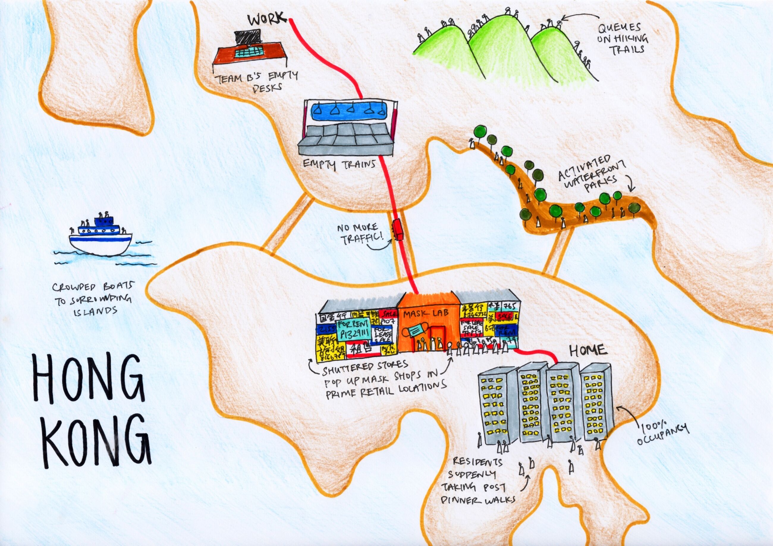
Tiara Lui - Hong Kong

Nice job showing the commute and pandemic disruptions to the city.

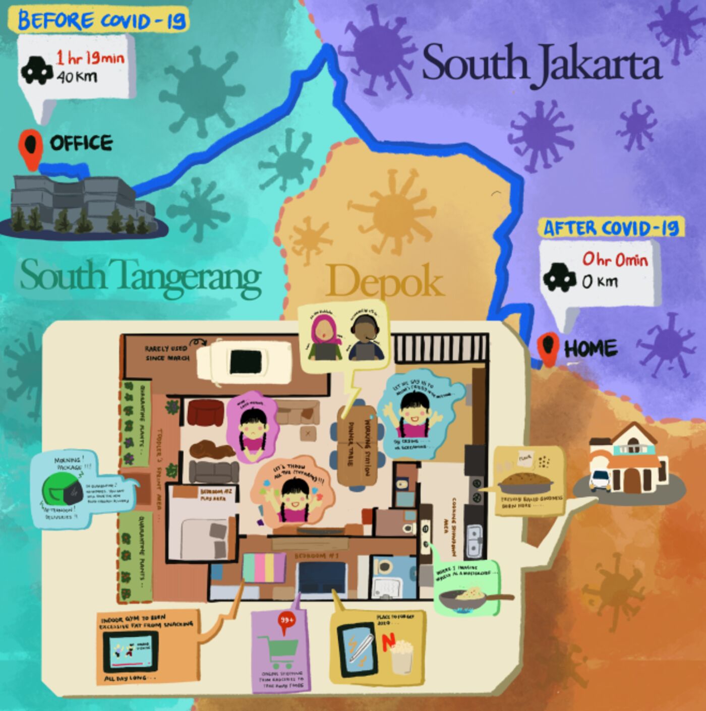
Nabilla Nur Anisah - Depok, West Java, Indonesia 

Many of the maps show floor plans of the residence as that is where people are stuck. I like this one because it contrasts the home life with the three hours of commuting to an office in South Tangerang.

Alfonso Pezzi - London transformed. Everything is delivered home including entertainment and work.

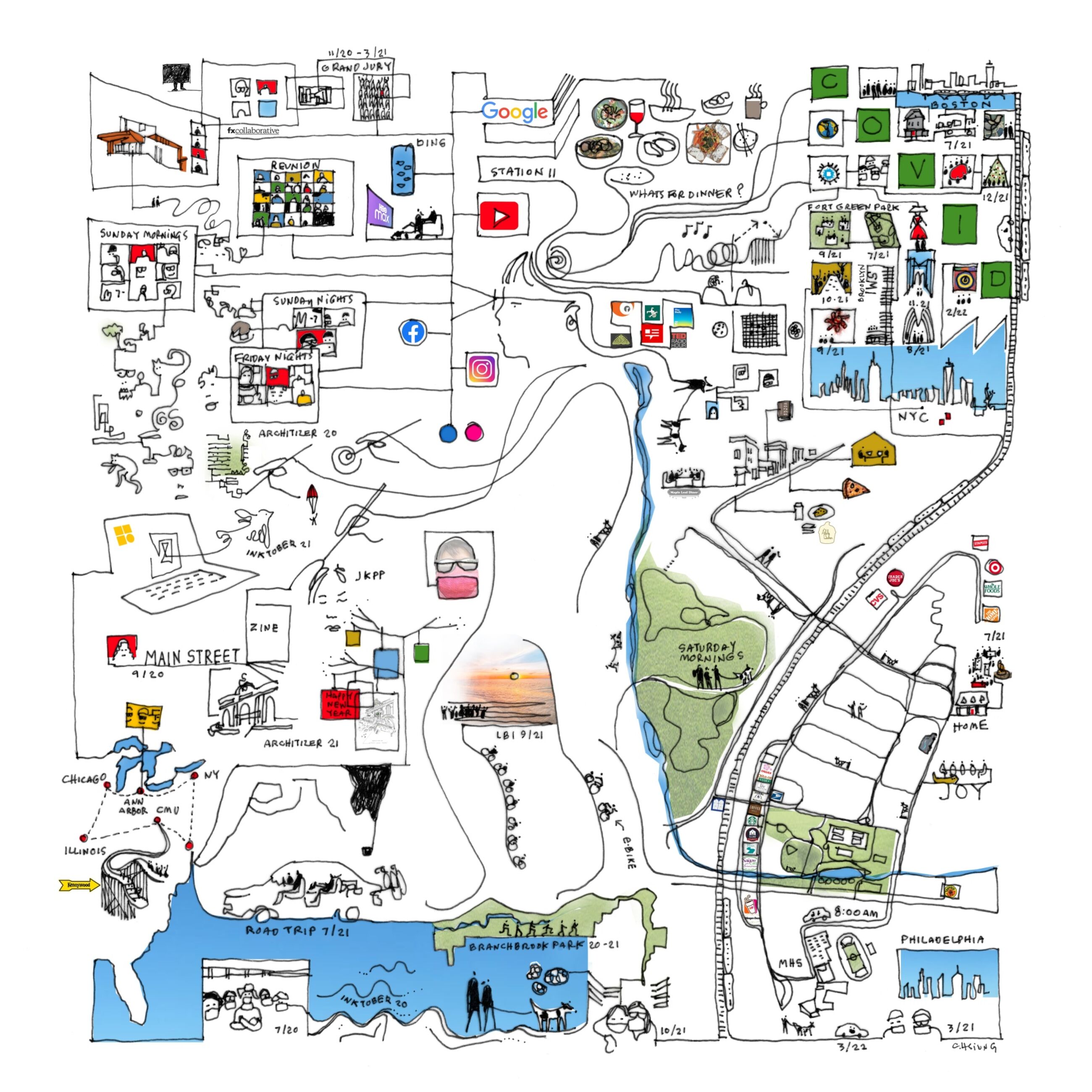
Finally here is one that did not make the atlas but I like all the intersecting geographies; floor plans, the local park, the drive to school, various road trips to nearby cities and then out to Illinois.

Carol Hsuing - Millburn, New Jersey


Wednesday, April 20, 2022

Mapping the Indigenous Diaspora

The Comunidades Indigenas en Liderazgo (CIELO), a non-profit advocacy organization, in conjunction with UCLA created a story map called We Are Here, showing the indigenous diaspora of Los Angeles. This is to counter the "statistical genocide" the US Census creates by lumping these groups under the broad Hispanic/Latino classification. This erases their cultural differences, including 30 different unique groups speaking over 17 indigenous languages. The map shows the locations of these language speakers by color.

Clicking on a zip code brings up a pie chart of the language speakers.

Unfortunately the colors of the pie chart are not the same as those of the map leading to confusion. On this graph the K'iche speakers are yellow but on the map they are green. On this chart they are blue.

The tabulation by zip code also creates confusing dot effects on the map where the shapes of more dense zip codes are emphasized. This graph within the story map shows the universe of languages on the maps.

The organization aims to get the public agencies of the City and County to recognize and provide translation services for these languages. Here is a translation card for the Guatemalan regional dialects - there is a separate card for Mexican regions.

As you scroll through the story map you get videos and map content showing the locations of festivals, conferences and organizations that aim to teach the cultural traditions.

The story map is on view at the Mixpantli: Contemporary Echoes exhibit of Los Angeles County Art Museum (LACMA)

Wednesday, April 13, 2022

Maury's Wind & Current Charts

U.S. Naval Officer Matthew Fontaine Maury developed wind and current charts starting in the 1840's. They helped save shipping companies millions of dollars and avoid losses of life and cargo by giving sailors critical information about wind and current patterns. 

Wind & Current Chart of the North Atlantic-via American Geographical Society Library

Detail off the coast of Tampico, Mexico
As director of charts for the Navy, Maury had access to decades of ships' logs. These logs included routes and weather conditions. During the California gold rush these charts helped shorten the trip from New York to San Francisco by 40 days or more. 

The length of the arrows denotes the strength of the current. Colors indicate the season of each track. The dots represent wind speed as indicated in the legend below.

Here is a detail of the mouth of the Rio De La Plata from one of his South Atlantic charts.
via Yale University Library

Maury went on to map the Pacific and Indian Oceans, monsoon patterns, ranges of the sperm whale and discovered an undersea plateau that could be used for laying the first transatlantic cable. More on his life can be seen in this PBS American Experience article.